We’re excited to announce the launch of our new visual brand. This isn’t just a new logo or color palette, it’s the visual expression of how far we’ve come and where we’re heading next.
Why We Rebranded
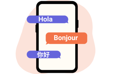
As our platform has expanded in sophistication, capability, and impact, it has become clear that our brand needed to grow along with it. Today, Satisfi Labs offers more than intelligent AI agents; we deliver a comprehensive conversational experience platform that bridges marketing automation, live escalation, and real-time AI agent engagement.
Our new brand reflects this evolution. It’s modern, cohesive, and confident, just like the platform and partnerships we continue to build. It’s designed to scale with us, clearly expressing the value we bring, and setting the tone for the next stage of growth.
What’s New
You’ll notice several major updates:
- The Double Delta Logo: A bold new symbol of transformation and conversation
- A Fresh Color Palette: Our cool-toned grayscale conveys a sense of maturity and sophistication, and secondary colors bring energy and contrast to key moments.
- New Typography: Featuring Sora for versatility and approachability, and JetBrains Mono for technical clarity.
The Story Behind the Double Delta
At the heart of the redesign is our new logo: the Double Delta.
The Double Delta symbolizes transformation, a nod to our co-founders’ roots in finance, where delta means change, and reflects how far we’ve come. The mirrored deltas reflect one another, representing our commitment to evolving conversation through both human understanding and advanced technology. They embody the duality at the core of Satisfi Labs: natural and intelligent, personal and scalable, human and machine – and visually echo two conversation bubbles, symbolizing the dialogue between humans and technology.
>It’s a mark of who we are and what we stand for: making conversational technology so natural and effective that it’s better than speaking with a human.

Our Color Palette: Visualizing Our Values
Color is more than aesthetics; it’s a language that communicates who we are and what we stand for. In our rebrand, we’ve curated a palette that reflects our core values, mission, and the duality at the heart of Satisfi Labs: human and machine, innovation and reliability. Our primary colors ground our identity, while our secondary colors provide flexibility and vibrancy, allowing us to adapt and resonate across various platforms and audiences.

Primary Colors:
- Satisfi Super Dark: A rich, grounded charcoal that represents the core of who we are. Satisfi Super Dark is our foundation, stable, confident, and built to support bold ideas and human-first technology.
- Labs Lunar Gray: A balanced, industrial gray that embodies precision, logic, and quiet confidence. Lab Lunar Gray represents the spirit of experimentation and continuous refinement. It’s the color of thoughtful iteration, where innovation is tested, proven, and made ready for the real world.
- Delta Dusk: A cool, refined blue-gray that symbolizes intelligent transformation. Delta Dusk captures our mission to create seamless change, where conversational tech becomes so natural that it redefines what’s possible.
- Conversational Cool Gray: A soft, modern gray with a whisper of blue, Conversational Cool Gray brings clarity without distraction. It reflects the calm, open tone of natural dialogue, approachable, thoughtful, and easy to engage with.
Secondary Colors:
- Quality Quartz: Inspired by the gemstone-like richness of this indigo-blue tone, Quality Quartz embodies durability, clarity, and crafted precision. This dependable shade captures our pursuit of excellence, delivering with consistency, care, and attention to every detail. Built to last, impossible to overlook.
- Bold Bright Green: An electric yellow-green that pops with bold energy and a touch of modern edge. Bold Brightgreen captures the spirit of risk-taking and originality. It commands attention, challenges convention, and leads with fearless intention. We don’t follow trends, we illuminate new paths.
- Authenticity Amethyst: A soft blend of lavender-blue that reflects calm, sincerity, and quiet strength. Authentic Amethyst evokes transparency and truth, showing up without pretense, speaking honestly, and acting in alignment with who we are. Always real, always present.
- Accountable Aqua: Cool, crisp, and steady, Accountable Aqua channels clarity and trust. Like flowing water, it moves with intention and reliability. We take ownership, follow through, and do what we say with integrity, every time.
- Resourceful Radiant Orange: Bright, warm, and full of creative energy, Resourceful Radiant Orange sparks ingenuity and action. It reflects our ability to think fast, adapt quickly, and find opportunities in every challenge. Scrappy, smart, and relentlessly inventive.
- Selfless Saffron: Golden and glowing, Selfless Saffron radiates warmth, care, and generosity. Like sunlight, it lifts others without seeking the spotlight. We act with empathy and purpose, elevating the collective over the individual.
What’s Ahead
This rebrand is only the beginning. It sets the foundation for a future where our platform will continue to grow, expand, and redefine what conversational experiences can be.
While the visual rollout begins with our brand assets and marketing channels, a complete website refresh will launch in late Q2, bringing even greater clarity and impact to how we tell our story.
We’re proud of the journey that got us here, and even more excited for what’s to come.